

Last Updated: September 16th, 2026 by Matthew Brown
Uniforms are a special commodity in sports. The more a franchise has to offer, the more potential money it could make because fans, at the end of the day, just want to look like their favorite professional players.
Don't lose this article. Enter your email below, and I'll send it to you right now. Plus, we'll send you other unbelievable stories from baseball's past.
In baseball, it can be even more creative. The MLB has pushed every team to create special versions of their uniforms that can further connect with their respective fan bases. Some organizations are better at doing that than others. We want to go over some uniforms that shouldn't make sense to be so popular.
13. The White Sox’s Shorts Experiment of ’76
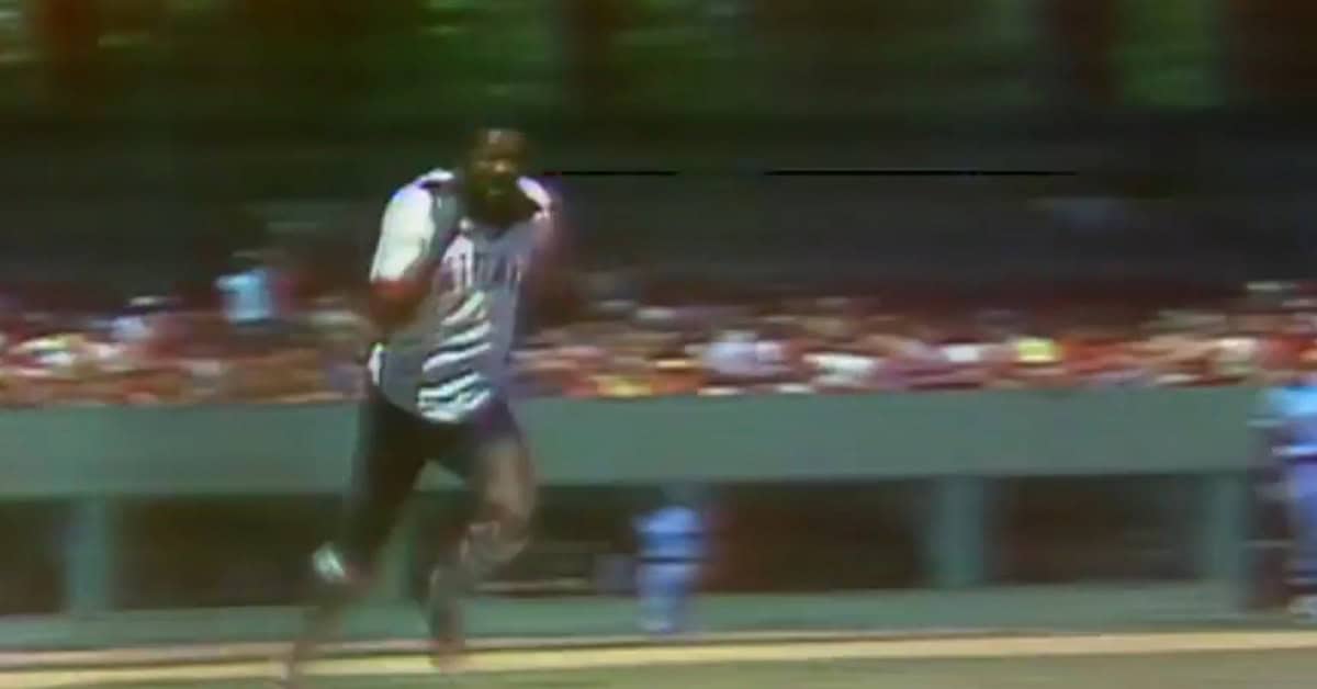
Sometimes tradition has very good reasons. The long pants in baseball have been a constant since the beginning. Yes, you may see some players tuck the bottom parts of their pants into their socks, but that doesn't mean that they are wearing just shorts.
In 1976, the ever-experimental Bill Veeck tried to force his Chicago White Sox to actually display their socks more, so they wore these shorts that just shouldn't ever be worn again on a baseball diamond. However, it was so terrible that it is memorable. That still doesn't make it any good.
12. Houston’s “Rainbow” Jerseys of 75-’86
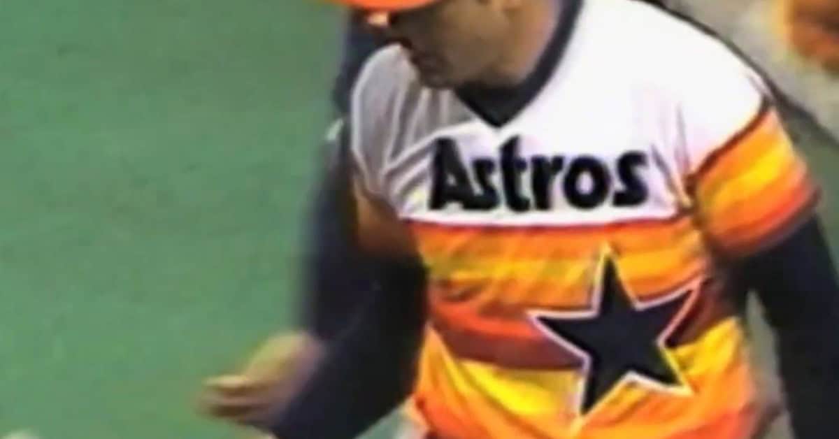
The Houston Astros tried to innovate with their jerseys in 1975 by using a method that is now iconic. Their Tequila Sunrise jerseys are some of the most memorable jerseys the franchise has ever put forth.
The mismatched horizontal stripes that have different shades of orange and yellow shouldn't look as good as they do now. There is something about the overall feel of this jersey that makes your brain confused about how ugly or how amazing this jersey looks.
11. The Pirates’ Mix-and-Match Uniforms of ’77-’84
There's something about the black and yellow of Pittsburgh sports teams that just feels right. There is no change in color on this uniform from the traditional colors of the team. The things that change are the designs and what hat goes with what jersey. Also, what pants go with what cleats.
The We Are Family Pirates had a bunch of different personalities that all came together to play as one. That showed in the jersey combinations that each individual would pick for the team on a given day.
10. The Phillies’ “Saturday Night Special” Burgundy Disaster of ’79
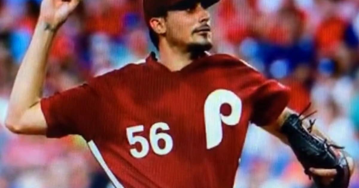
Burgundy isn't exactly a color that screams sports. It does bring a sense of higher class and prime-time socialization. In a way, that matches what baseball is at night. The Phillies tried to capture that feeling with their jerseys, and it wasn't exactly the biggest hit.
We're going with a certain version of their burgundy that was the Saturday Night Special in 1979 and it was just an entirely burgundy uniform with some white (but not enough), this was just a bit much for my taste.
9. The Seattle Pilots’ “Scrambled Eggs” One-Season Wonder of ’69
These uniforms are definitely iconic because this team lasted only one season in history. I will say that the design is definitely daring, yet it comes out looking really cool after all these years.
The Milwaukee Brewers of the current day have been gracious enough to allow the current Seattle team to be able to wear throwbacks of the Seattle Pilots from time to time. It's kind of cool seeing the Mariners, like Julio Rodriguez, sport a uniform that only lasted a summer back in 1969.
8. The Cardinals’ “Victory Blue” Road Uniforms of ’76-’84
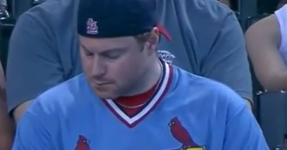
The blue uniforms of the St. Louis Cardinals might be the most iconic powder blue uniforms in baseball. There aren't many to compete with this, but it just feels like the Cardinals do it right.
Picturing the great Ozzie Smith wearing this uniform for much of his career just feels like the Cardinals, even though powder blue, or Victory blue, is nowhere near their regular color scheme. The way it fits into their jersey design with the red and yellow almost completes it. Remember, the primary colors are red, yellow, and blue. Why not include them all in the same jersey?
7. The Padres’ Brown & Yellow Original Look of ’69-’84
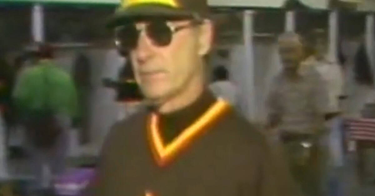
The San Diego Padres were an upstart franchise in 1969. There were plenty of sports teams coming into the fold around that era. So any new team needed to think of a way to stand out amongst the crowd.
The Padres certainly did that by choosing a color that is rarely picked in sports: brown. They wanted most of their jersey to be brown. That is not exactly the most flattering color in the spectrum. Then they paired it with the color of yellow and then a touch of orange, even though thinking of that color combination doesn't exactly bring excitement.
It certainly does nowadays when the Padres have reverted to using a combination of brown and yellow in today's uniforms.
6. The Second Turn Ahead the Clock Uniforms
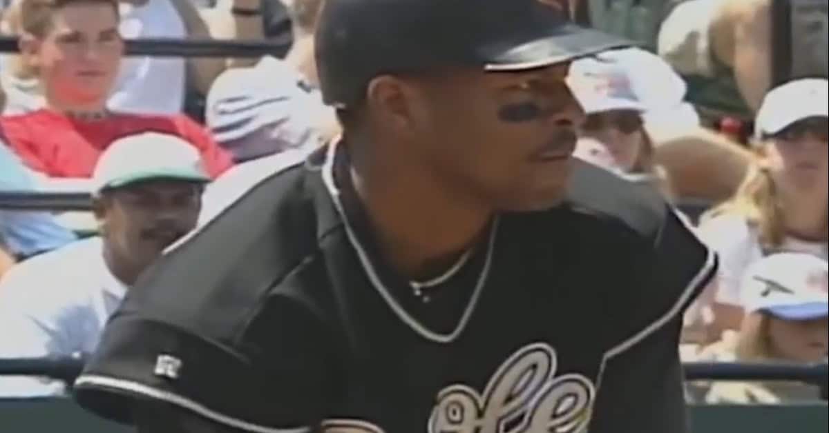
One of the coolest looks in baseball history was when the MLB first tried a promotion where a team would wear a futuristic-looking uniform.
These Turn Ahead the Clock uniforms gave us one of the most iconic photos in baseball history, with Ken Griffey Jr. and his backward cap playing in these uniforms.
5. The Giants’ All-Orange Alternates of ’77
Orange tops have always been a part of the Giants. That's what makes this uniform so significant. In a way, they were kind of copying the extremely successful Baltimore Orioles of the time when the Giants came out with these in 1977. It was simply an orange uniform.
Yes, there were some black and white stripes and numbers throughout, but they were very minimal, and the orange certainly popped out. Does that have a good connotation or a bad one? I don't know.
4. Cleveland’s All-Red Uniforms of ’75-’77
Cleveland had some appropriately loud uniforms for how much they wanted to entertain the fans. The jersey and pants combination had a blood-red color from top to bottom.
It was a uniform that didn't last particularly long, and I don't think many fans wanted to buy that jersey. However, I will say that I don't live in Ohio, so maybe there are some out there that love it.
3. The Braves’ Bold Blue Road Uniforms of 72-’75
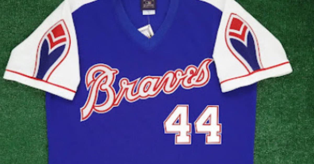
It's always interesting to look back at the Atlanta Braves uniform collection, because they switched cities multiple times. They have kind of switched from having some blue alternate uniforms to focusing more on red in the present day.
I'd have to admit that the blue uniforms are the ones that I associate most with the franchise among the uniform choices. Now I usually think of the powder blue base uniforms, but these ones focus on the royal blue that Hank Aaron wore; maybe not the full blue uniform all the time, but that royal blue was a mainstay in the Braves' look.
2. The Marlins’ Original Teal-Heavy Look of ’93
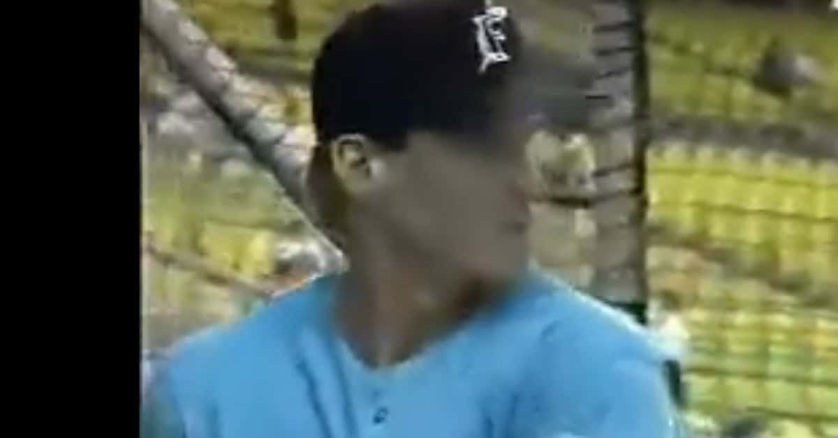
Teal was a very big thing in the 1990s, and it is just one of those colors that I personally gravitate towards when looking at sports teams.
The Florida Marlins were just that type of team before they became known as the Miami Marlins, which have far less cool jerseys to work with. The teal jerseys just bring a sense of nostalgia while fully knowing that this is a very unorthodox jersey choice.
1. The Athletics’ “Wedding Gown” White Uniforms of ’73
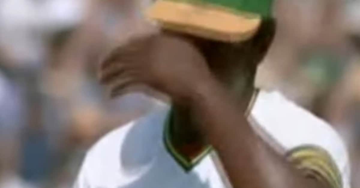
Sometimes, a uniform can look so clean that it is too clean. The Oakland A's had a brief phase where they would wear an all-white uniform that would have their yellow and green slightly piped around the uniform. This created a little bit of problems, especially for the A's themselves, because it could be distracting to everyone.
It's been rumored that they had a hard time seeing each other in the dugout because their jerseys were so bright; if the light was shining on them in a certain way, it could pretty much catch them off guard. They were able to catch some teams off guard, as those days in Oakland were some special ones in the win column.